WHY and WHEN?
To advertise new products related to their launch during the FW or to advertise a particular event.
WHERE?
Close to the location of the fashion show or in some specific areas of the bigger cities.
HOW?
Creating an interactive structure, something that can attract the attention of the people.
Giving information about the brand, advertising it, and at the same time creating an experience.
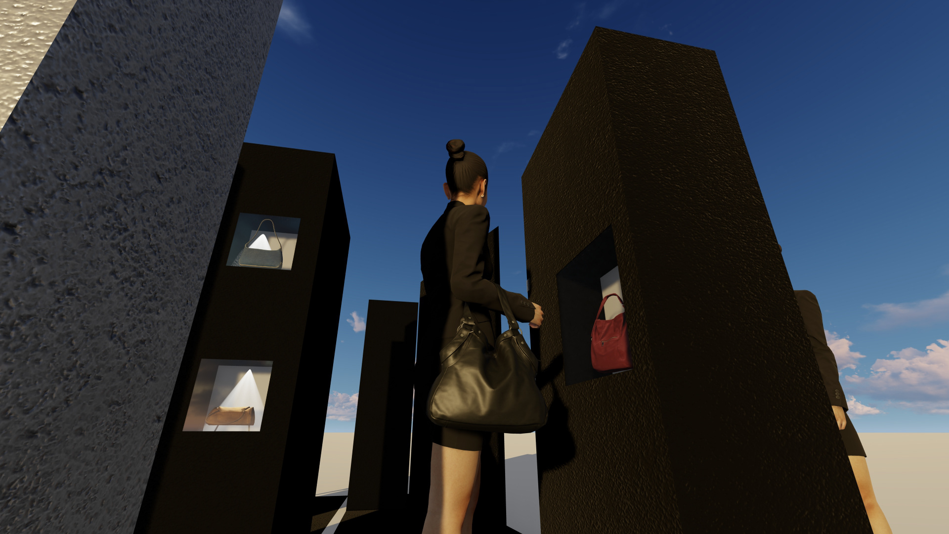
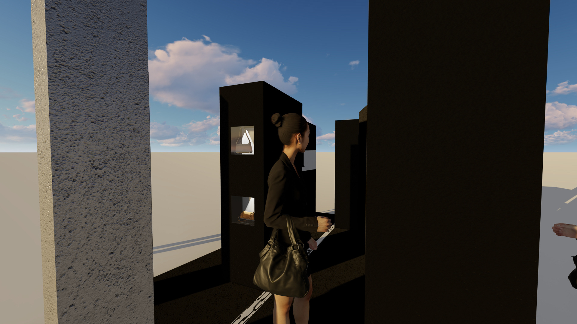
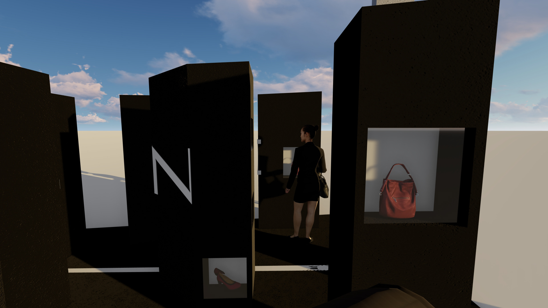
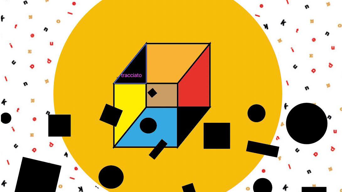
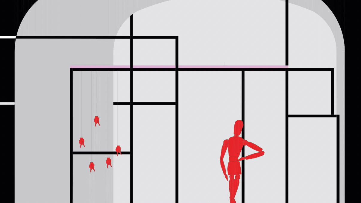
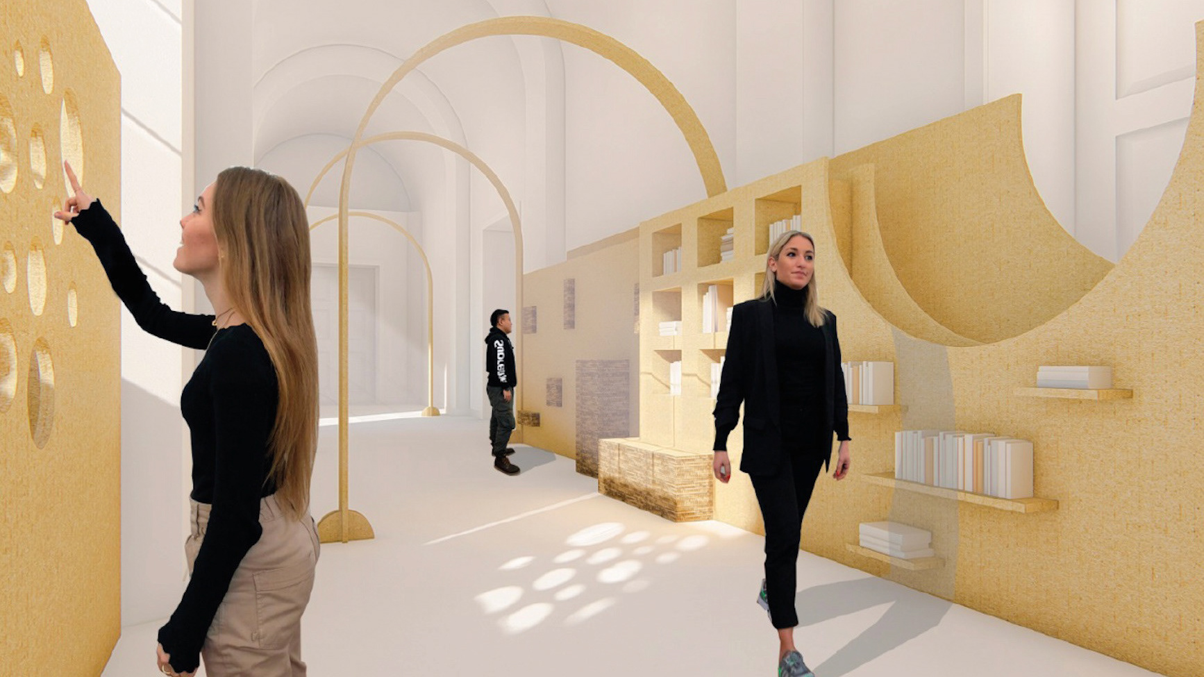
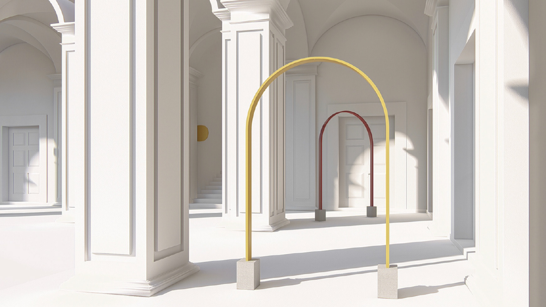
I identified one of the characteristics of the CELINE brand which is the use of simple shapes and played with them to create new and unique shapes.
The projected structure is composed of different polygons through which people can walk. These polygons, seen from a specific point of view, create together a bi-dimensional image through the technique of anamorphosis.
(look at the video)
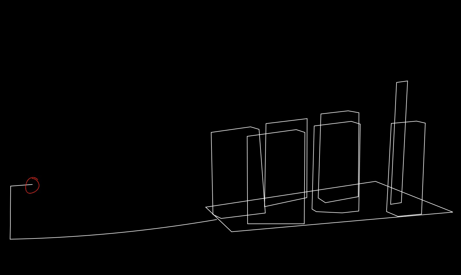
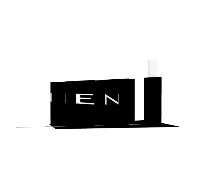
The result obtained is a series of shapes apparently without a sense, but, if seen from a specific point of view, they assume a specific shape: The square with inside the Celine lettering.
The colors chosen are the two basic colors in general, and the most used color by the brand: Black and white.